
Mobile-friendly design.
Every site we build is mobile-first by default - tested on real phones, fast on 4G, accessible on every device.
What you get
Built mobile-first, properly.
You're busy running a business. We take the project off your plate from day one - let's build something amazing together.
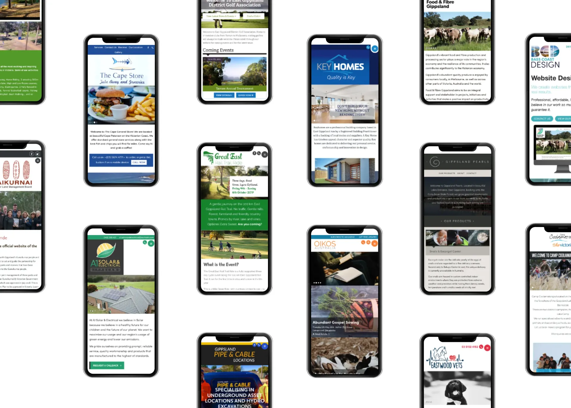
Mobile-friendly website design for Gippsland businesses. Responsive, fast and accessible on every phone, tablet and desktop.
Every mobile-friendly design project we take on is built around your business and your customers, not a template, not a plugin stack, not somebody else's framework.
We give you a fixed quote up-front with everything itemised. No scope creep, no surprise invoices. After launch, we look after the site for as long as you want us to, and you can take it elsewhere any time.
What's included
Everything you need,
in the quote.
Standard inclusions on every mobile-friendly design engagement. Anything beyond this gets quoted up-front so you always know what you're paying for.
- Mobile-first design from the wireframe stage
- Tested on real iPhone and Android devices
- Fast on 4G and patchy regional networks
- Touch-friendly tap targets
- Click-to-call and click-to-map shortcuts
- Optimised image delivery per device
- Accessible focus states and contrast
- Lighthouse mobile score of 90+
Mobile-first, properly
Most of your visitors are on their phone.
For most local businesses we work with, 60-80% of website traffic comes from mobile. The mobile experience isn't a smaller version of the desktop site - it's the main game.
"Mobile-first" gets used as a marketing line. For us it's a methodology: every wireframe, every layout, every component is designed and tested on mobile before we even open it on a desktop.
The result is a site that loads fast on patchy regional 4G, has touch targets you can actually hit, and surfaces the things your customer wants in the order they want them.
Real-device testing
Tested on the things
people actually use.
Real iPhones and Androids
We test on actual handsets, not just browser emulators. Things break on real devices that look fine in dev tools.
Slow connection mode
Throttled to a realistic regional 4G profile. If a page takes 8 seconds on slow mobile, we fix it before launch.
Touch-target audit
Every button and link is checked for 44x44px touch area. No frustrating misclicks because the link is squished between two paragraphs.
Why it matters
A bad mobile experience
costs you customers.
Google has been mobile-first indexing since 2019, which means the mobile version of your site is the version that determines your search rankings. A site that's hard to use on mobile doesn't just lose mobile customers - it loses desktop ones too, because Google ranks it lower.
Beyond ranking, Core Web Vitals (Google's measurement of real-world page experience) are weighted heavily on mobile. We aim for a 90+ Lighthouse mobile score on every site we build, and we don't ship a launch that doesn't hit it.
Other services
Need something else?

Ready when you are
Start your new website project.
Ready to take your business or organisation to the next level? We're here to help you build a powerful online presence that works for you 24/7.